
css水平垂直居中
这是一个很常见的样式布局,网上也有很多的实现方式,本文主要是针对一些比较常用到的方法做一下总结,记录一下。
现有实现方式大致的思路归纳为以下几种:
- 固定宽高居中
- absolute + margin auto
- absolute + 负 margin
- absolute + calc
- 不定宽高居中
- lineheight
- flex
- absolute + transform
- grid
- table-cell
公共代码(后面代码都基于这里)
html
<div class="out">
  <div class="inner">水平垂直居中</div>
</div>
实现的效果: 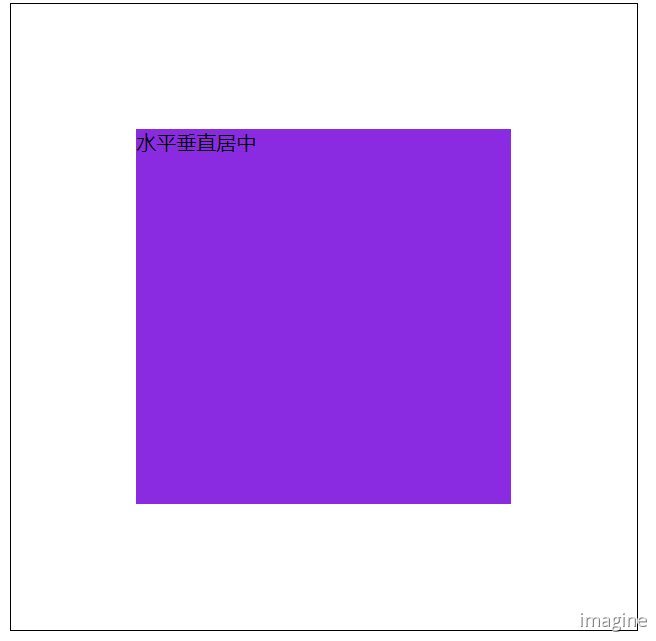
absolute + margin auto
css
.out {
  width: 500px;
  height: 500px;
  border: 1px solid #000;
  position: relative;
}

.inner {
  background-color: blueviolet;
  width: 300px;
  height: 300px;
  position: absolute;
  top: 0;
  left: 0;
  right: 0;
  bottom: 0;
  margin: auto;
}
absolute + 负 margin
css
.out {
  width: 500px;
  height: 500px;
  border: 1px solid #000;
  position: relative;
}

.inner {
  background-color: blueviolet;
  width: 300px;
  height: 300px;
  position: absolute;
  top: 50%;
  left: 50%;
  margin-left: -150px;
  margin-top: -150px;
}
absolute + calc
css
.out {
  width: 500px;
  height: 500px;
  border: 1px solid #000;
  position: relative;
}

.inner {
  background-color: blueviolet;
  width: 300px;
  height: 300px;
  position: absolute;
  top: calc(50% - 150px);
  left: calc(50% - 150px);
}
lineheight
css
.out {
  width: 500px;
  height: 500px;
  border: 1px solid #000;
  line-height: 500px;
  text-align: center;
  font-size: 0px;
}

.inner {
  font-size: 16px;
  background-color: blueviolet;
  display: inline-block;
  vertical-align: middle;
  line-height: initial;
  /* 若需要设置元素的宽高时 */
  /* width: 300px;
    height: 300px; */
  text-align: center;
}
flex
css
.out {
  width: 500px;
  height: 500px;
  border: 1px solid #000;
  display: flex;
  justify-content: center;
  align-items: center;
}

.inner {
  background-color: blueviolet;
}
absolute + transform
css
.out {
  width: 500px;
  height: 500px;
  border: 1px solid #000;
  position: relative;
}

.inner {
  background-color: blueviolet;
  position: absolute;
  top: 50%;
  left: 50%;
  transform: translate(-50%, -50%);
}
grid
css
.out {
  width: 500px;
  height: 500px;
  border: 1px solid #000;
  display: grid;
}

.inner {
  background-color: blueviolet;
  align-self: center;
  justify-self: center;
}
table-cell
css
.out {
  width: 500px;
  height: 500px;
  border: 1px solid #000;
  display: table-cell;
  text-align: center;
  vertical-align: middle;
}

.inner {
  background-color: blueviolet;
  display: inline-block;
}
好了,基本上就这些了;还有些不怎么用到的就没去整理了。
- PC 端:考虑兼容性的话推荐使用 absolute+负 margin 和table-cell; 否则直接 flex。
- 移动端:首推flex。
评论
填写昵称和邮箱即可留言,无需登录。